Condor1970
Well-Known Member
- Joined
- Oct 4, 2018
- Threads
- 95
- Messages
- 1,567
- Reaction score
- 582
- Location
- Port Orchard WA
- Vehicle(s)
- 2018 Mustang GT
- Thread starter
- #1
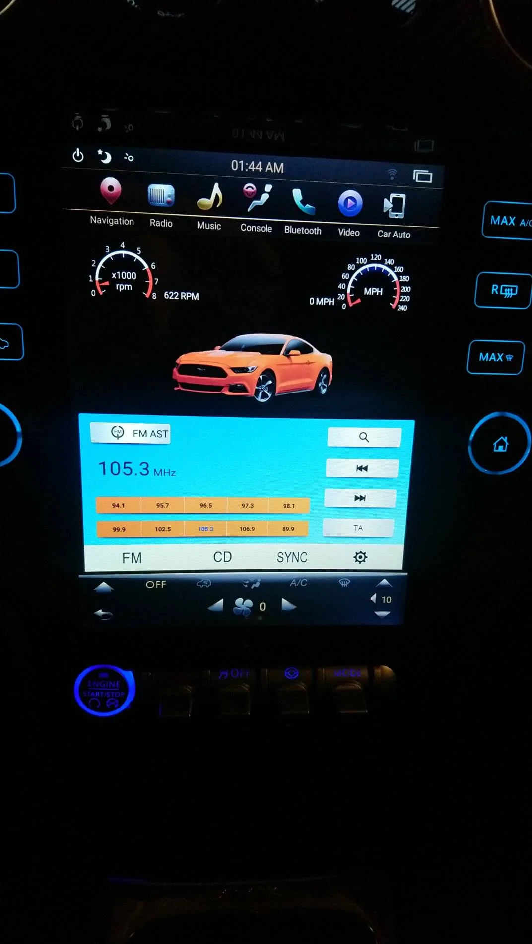
I know there is a huge Tesla screen thread, but I wanted to start one specifically for the new Phoenix PX6, which is by far the most expensive vertical screen android radio out there, and also the nicest looking. I wanted to talk all that I find good, and also quite a bit of very bad when it comes to this radio.
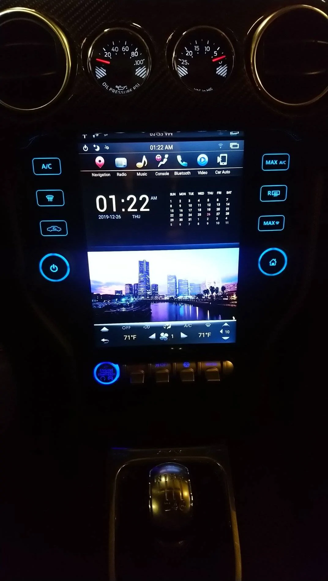
Aesthetically the design of a full glass like surface with extra AC controls on the sides, looks absolutely fantastic. This is where they really did a good job in the design. Also the volume and song advance knob is nice, but there is an issue with these.
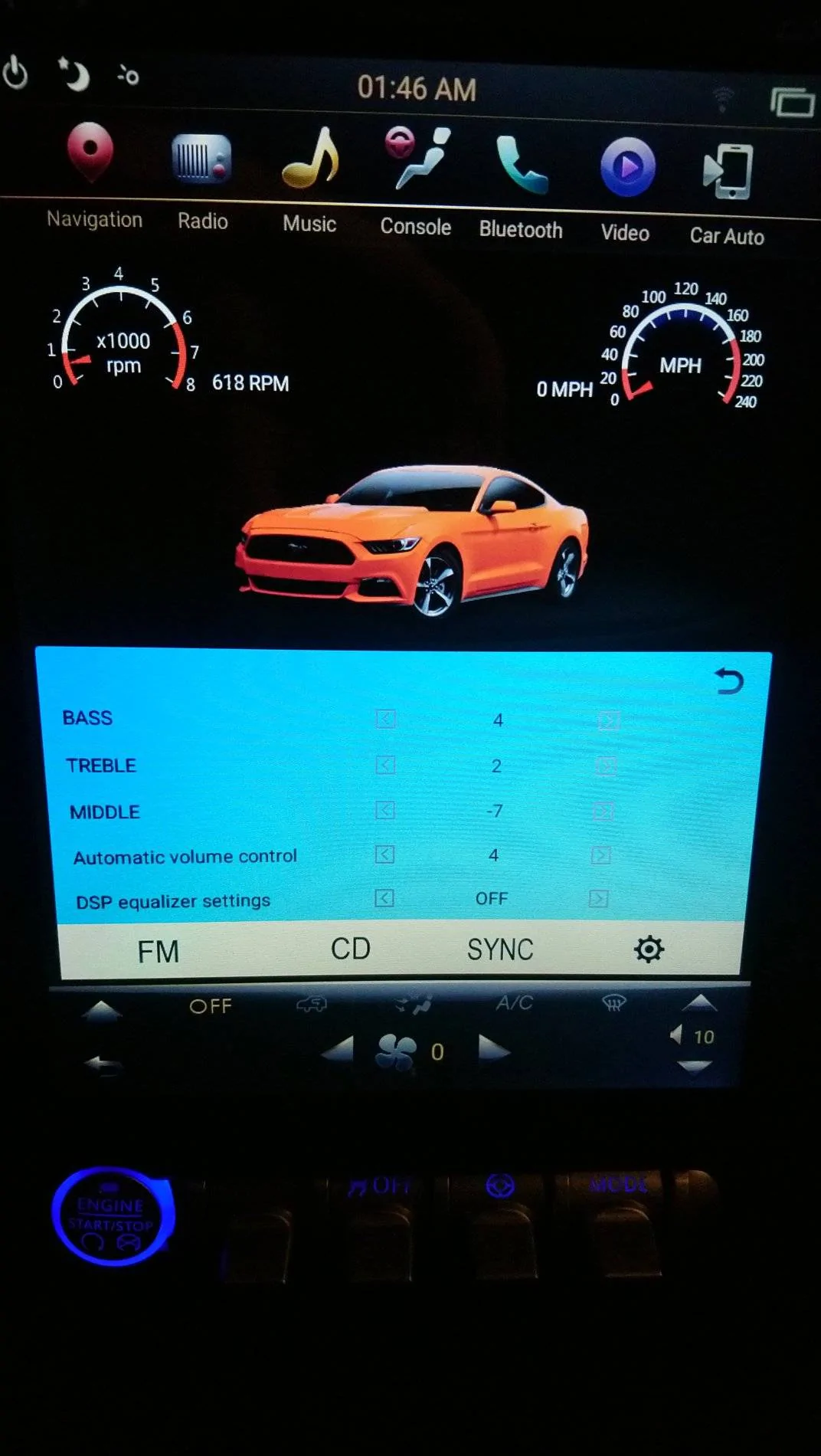
I wish the "knobs" were programmable and could be edited to operate AC functions instead of just the radio, but that is kind of nit-picking. They have programming for the A/C touch points, but not the digital knobs.
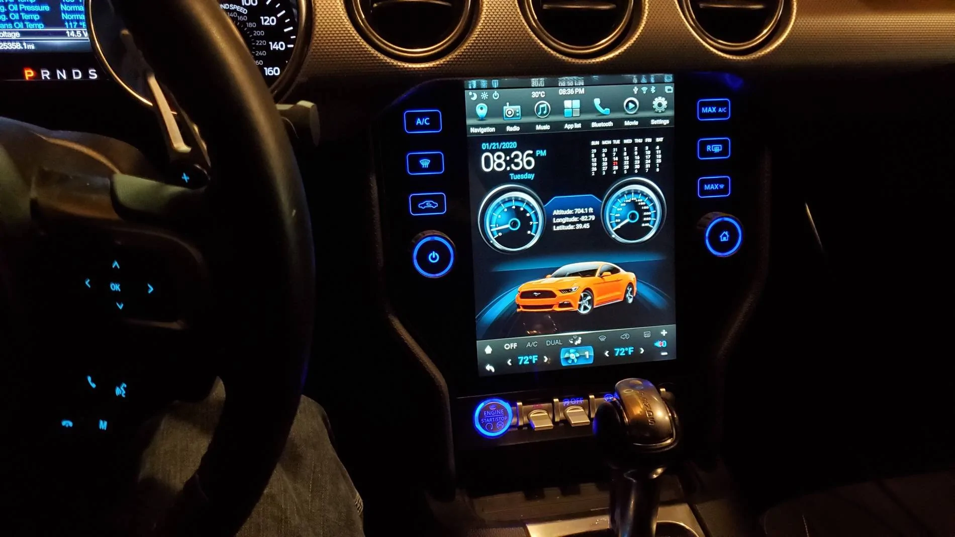
My first complaint, is the home screen. It has this huge clock and calendar, which is completely useless. You can't use it for anything at all. It just takes up space. And, the city-scape pictures below are completely useless. You can't even edit those to get rid of them, and put a different picture in there. It's very amateurish. A real home page allows for basic widget apps, like weather and news links, etc.. To be honest, the home page should have the Sync software/radio in the bottom panel, and not useless pictures of cities none of us live in.

Aesthetically the design of a full glass like surface with extra AC controls on the sides, looks absolutely fantastic. This is where they really did a good job in the design. Also the volume and song advance knob is nice, but there is an issue with these.
I wish the "knobs" were programmable and could be edited to operate AC functions instead of just the radio, but that is kind of nit-picking. They have programming for the A/C touch points, but not the digital knobs.
My first complaint, is the home screen. It has this huge clock and calendar, which is completely useless. You can't use it for anything at all. It just takes up space. And, the city-scape pictures below are completely useless. You can't even edit those to get rid of them, and put a different picture in there. It's very amateurish. A real home page allows for basic widget apps, like weather and news links, etc.. To be honest, the home page should have the Sync software/radio in the bottom panel, and not useless pictures of cities none of us live in.
Sponsored
Last edited: