I don't think so, one is raised and the other is indented, but they look like the same font.
The snakes are all the same shape, but it's funny that none of them have the same scales as any other. They do have 9 months to get them right though, it is just a prototype.
I'm not to fond of the rectangle on the grill. I think it would look better with just a snake on the grill and in back too for that matter. Put the rectangles where the 5.0 would go on the fender. The dash plaque is fine.
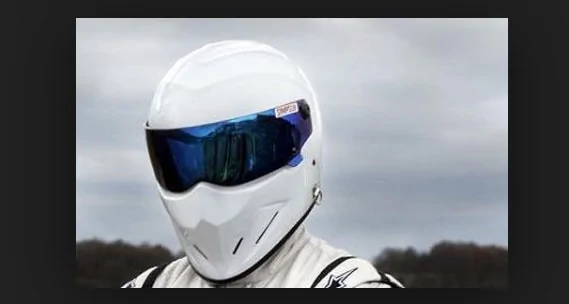
He is talking about the Stig from Top Gear... The UK one. He was never to speak or let on who he was.... Well he wrote a book and told the world. The Top Gear boys launched him off an Aircraft Carrier and got a new Stig
Completely agree with the OP here. While it might be a "little" thing to some, constancy is key when trying to deliver a top-notch product. Ford, make sure all snakes on the car are the same come production.
He is talking about the Stig from Top Gear... The UK one. He was never to speak or let on who he was.... Well he wrote a book and told the world. The Top Gear boys launched him off an Aircraft Carrier and got a new Stig
The book is darn good, too. Definitely give it a read if you have a chance. The only real downside is that my "I am the Stig" t-shirt doesn't make as much sense. I just pretend it applies to the new guy.
OK...I love the new logo...But if anyone is gonna be speaking with Moray Callum or Chris Svensson please tell them to be consistent!!!
MY Pet Peeve is inconsistency....
LOOK...Steering Wheel and front and rear emblems are the same design...then the dash plaque is different...MAKE EM ALL THE SAME...
Ford did this in 2010 when they redesigned the pony emblem and still used the old horse for the Boss 302 grille and Pony PKG fenders...ALSO this year they have a new GT font for the 5.0 trunk emblem...but STILL use the old GT logo (05-14) on the Strut tower brace of the Performance Pack!!!!!!!!!! Ah!
")