At your dealer, or a 'Quickie Lube? My dealer separated their service dept. Quick lane is for oil & tires only. So it's like a QL but run by the dealer for Fords only. The tech could not tell me why I used 3/4 of a quart in 1200 miles but said it was the norm...
I'm with you, the cone boob points have to go. I have friends in the aero industry who are going to scan the stock spoiler on my Bullitt, and help me edit the 3D model developed in Solidworks to dehorn the spoiler and get it pared down to something more aesthetic. I concluded simply deleting the black poly piece was going to result in as much work as making a new one and painting it DHG. The Solidworks 3D file will be used to make a plug for the mold, and a SoCal firm who makes high quality carbon parts for rice is willing to build the mold and pull a few parts for me. More work than I wanted, but I don't like the points either...and it will keep me out of the bars at night :-)
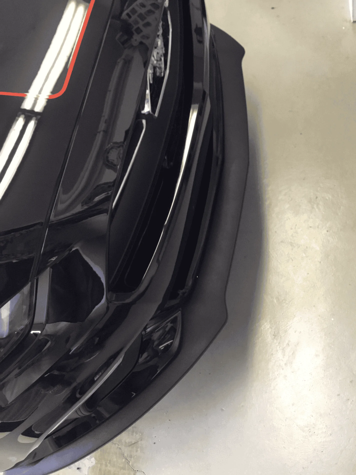
Funny, the very back end (dog bowl) and front end (cone boobs, or Dagmars as we used to call 'em) are fugly, while everything else in between (except possibly the hood vents) is gorgeous.
When I had my first oil change i was looking at the spoiler while on the lift and mentioned that I wanted to take it off. The tech told me that another Bullitt was in last week and had marks on the spoiler tips. I asked what happened. He told me the guy pulled into a parking spot that had those F...... concrete wedges to stop the car from going past the spot. The tips hit it and the guy stoped. Food for thought....
yes, everything else is gorgeous!
I spent a lot of time searching the web for some kind of template for chrome lettering. My letters should arrive tomorrow & I think I know where I want them: along the truck end on the right side. I know how to distance them with tape top to bottom. It's between letters that I'm stuck. Since I'm putting them on the painted trunk I don't want to make a mistake.
Comments?
See if you can find a similar font in Word, lay out a document and fiddle with the kerning (distance between the letters). Once you are happy with how it looks, print a copy and make register marks on the trunk with blue painters tape - or "green" Frog tape...and Bob's your Uncle.