SStormtrooPer
Dark Side
- Joined
- Aug 17, 2013
- Threads
- 5
- Messages
- 426
- Reaction score
- 54
- Location
- Lafayette, CO
- First Name
- Jesse
- Vehicle(s)
- Single Turbo GenII Coyote Swapped '92 SSP
- Thread starter
- #1
So, when I first saw the pictures of the real car, not only did I dislike it, I hated it. I really couldn't really put my finger on what it was overall.
Appearance-wise,
- I REALLY dislike the fog lamp area. The marker/turn signal above the fogs looks like a cheap after thought, and it is a feature a number of other cars already have -- on the VW CC it looks VERY similar.
- Second, I don't like the piano black panel on the rear end. I don't like that is is just a flat plasticy looking piece and I think the glossiness of it is cheap
- Third, I rather have nothing on the tail in lieu of the stand alone pony or GT lettering, both of which look out of place.
- Last, I think the lower crease would have looked amazing turning up into a deep, chiseled C-scoop -- I am really missing that, which I think is one of THE trademark "Mustang" traits.
Those are the littler things I KNOW I don't like, but I still couldn't figure out what was ruining it for me.
So let me ask those who didn't like it when they first saw it -- what was it for that changed your mind?
For me it was when I was in the Photoshop/Rendering thread and I saw this:

Not only do I like it, this is one of the most BADASS things I have ever seen.
While I still don't like those little things, I realized what was ruining for me -- it was the color, especially the red, which I think was a bad choice for the reveal. I realized there is only one color for a Mustang. I guess you know what they say about going black...
Now if Ford would have made it a little smaller. I hope there is good news about the weight. ;)
Appearance-wise,
- I REALLY dislike the fog lamp area. The marker/turn signal above the fogs looks like a cheap after thought, and it is a feature a number of other cars already have -- on the VW CC it looks VERY similar.
- Second, I don't like the piano black panel on the rear end. I don't like that is is just a flat plasticy looking piece and I think the glossiness of it is cheap
- Third, I rather have nothing on the tail in lieu of the stand alone pony or GT lettering, both of which look out of place.
- Last, I think the lower crease would have looked amazing turning up into a deep, chiseled C-scoop -- I am really missing that, which I think is one of THE trademark "Mustang" traits.
Those are the littler things I KNOW I don't like, but I still couldn't figure out what was ruining it for me.
So let me ask those who didn't like it when they first saw it -- what was it for that changed your mind?
For me it was when I was in the Photoshop/Rendering thread and I saw this:
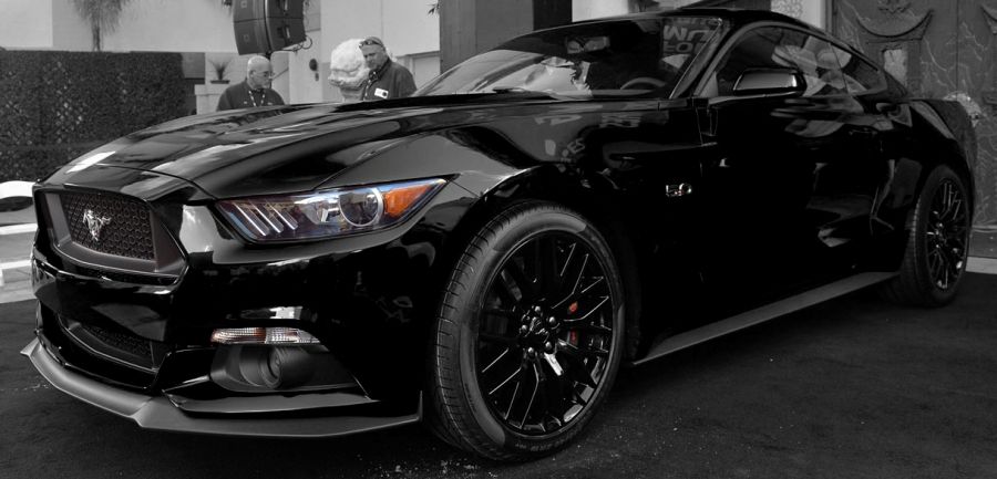
Not only do I like it, this is one of the most BADASS things I have ever seen.
While I still don't like those little things, I realized what was ruining for me -- it was the color, especially the red, which I think was a bad choice for the reveal. I realized there is only one color for a Mustang. I guess you know what they say about going black...
Now if Ford would have made it a little smaller. I hope there is good news about the weight. ;)
Sponsored
